Noise
2010
Brand Identity for a pioneering Spanish digital marketing agency boosting social network strategies.
Brand Identity
Graphic Design
Graphic Design

A capture of noise
Social Noise aims to help brands and organisations position themselves within the media landscape.
At the time of the project, most of the relevant companies in the market were in the process or about to shift from traditional communication to new media tools and environments. Throught this path, Noise started to scalate really fast, and they needed to rethink their whole new identity in order to adapt to their actual structures and future challenges.
Assignment
and challenge
As a result of growth and positioning strategy, Noise asked me to redesign their identity, based on a combination of strong business focus while reinforcing an aesthetic sense. Behind its name, resides the understanding of noise as the effective amplification social media generates.
The challenge of the project was to to find long lasting graphical solutions while working within very fast changing environments, as in any context related to technology. This also implies to create brand concepts that can grow flexibly in sub brands.
Approach
and execution
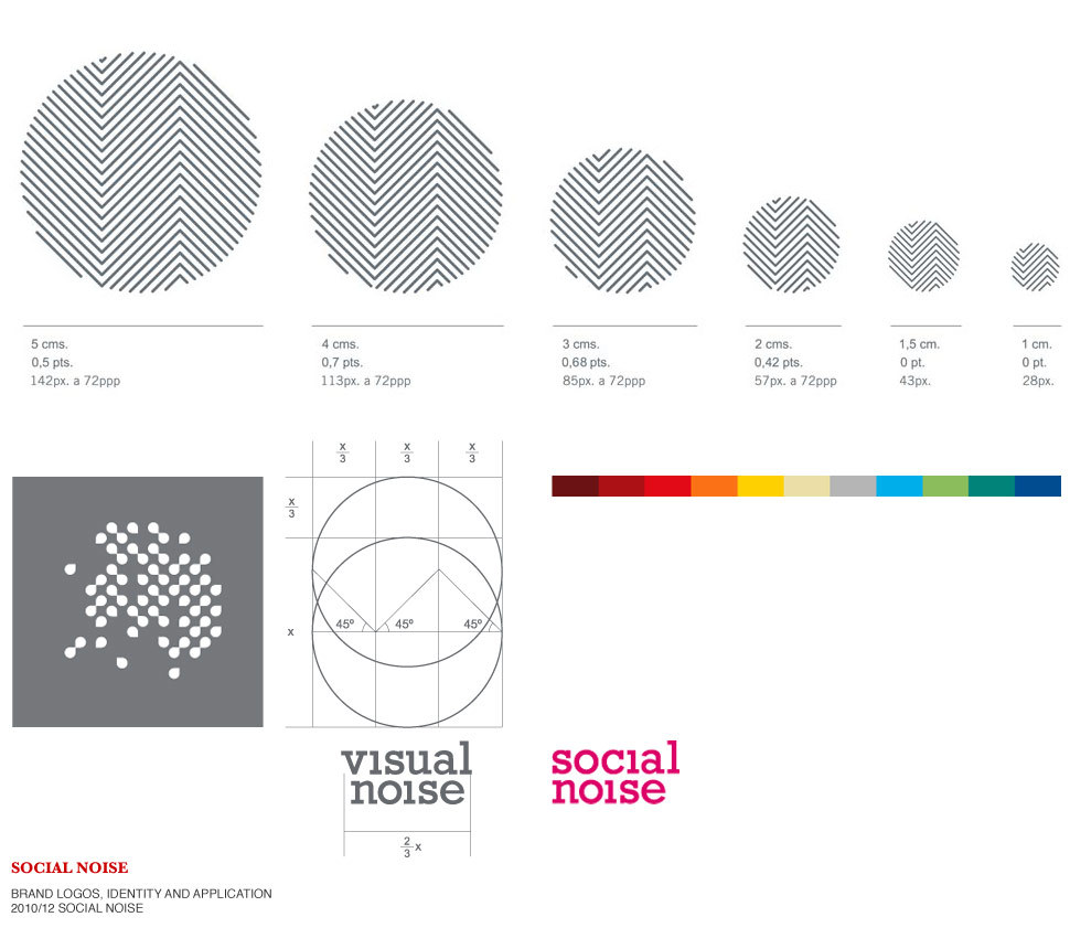
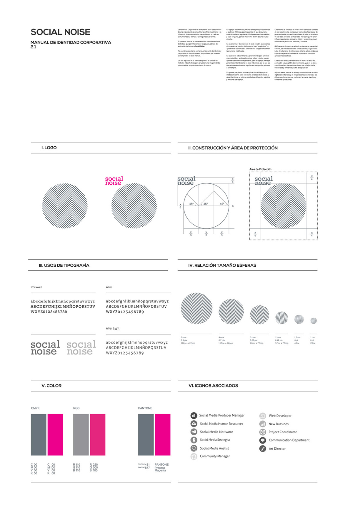
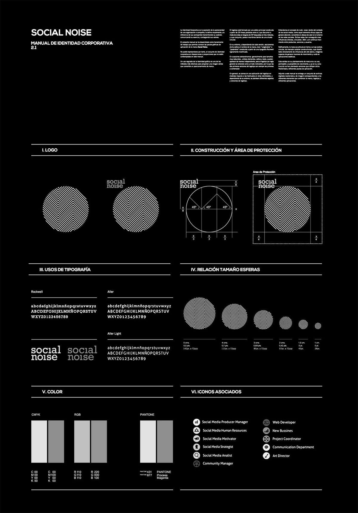
Graphically, the brand articulates around a circular idea of controlled visual disturbance -noise-. An optical illusion generated by the logotype that needs from the active participation of the viewer and varies across the whole spectrum of platforms, printed and digital applications.
Implied also in the logotype the texture of a fingerprint, a digital print caused by the user where the term digital relates to both technology and a personalized use.
The symbol is accompanied by solid typography and bold combination of colors; gray (tech) and pink (shout) as main palette and a subdivision of color spectrum associated to specific tools and services.
Corporate Identity Manual
![]()
social noise

The mother brand and the blueprint for the whole new set of appliances. A vertical group of three parallel lines displayed in angle, inscribed within the main circumference.
![]()
visual noise

The sub brand was created to cover the need of audiovisual content internally developed by this new department. A circular lense emerges from the main sphere, creating a new optical trick.
![]()
digital noise
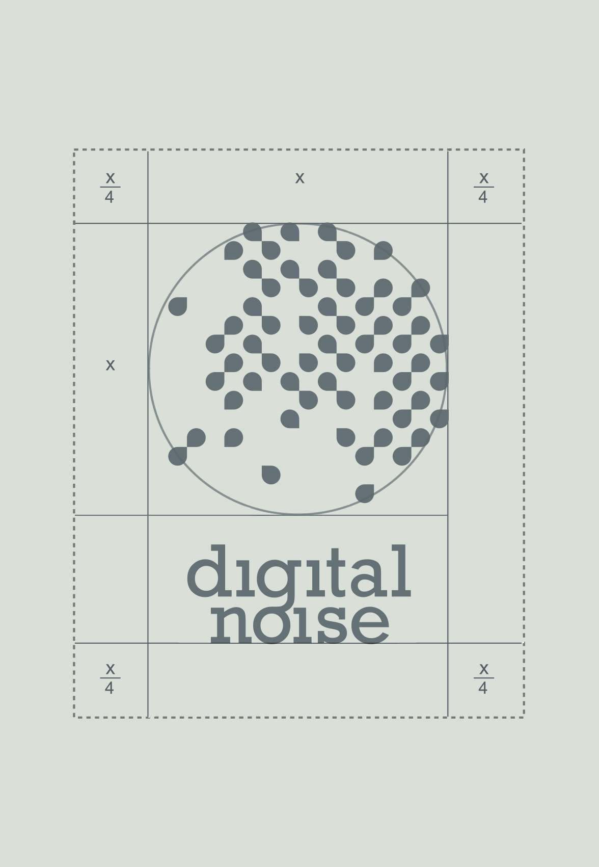
Another sub brand more focused in IT support rather than content. The logo presents within the same constructive sense, a flexible and animated grid of drops.
Digital Landscapes
I played with a number of abstract compositions and unorganized patterns that may work as backgrounds displayed in grids, and complementary graphic resources.


Benjamin Plé