CA2M Jóvenes
2017
Logo and campaign design for the youngest area of CA2M Art Center in Madrid. A transversal approach to contemporary culture and surroundings.
ca2m.org
Art Direction
Graphic Design
Logotype
Graphic Design
Logotype
CA2M Archive
No Más Clases
CA2M (Centro de Arte Dos de Mayo) is one of the youngest art centers stablished in the community of Madrid (Spain), known for its transversal approach to contemporary culture and its surroundings.
Almost since the beginning, I have had a special relationship with the centre, first as a visitor and user, later invited as a guest artist developing workshops, art interventions and publications.
I even slept during the night there.
Almost since the beginning, I have had a special relationship with the centre, first as a visitor and user, later invited as a guest artist developing workshops, art interventions and publications.
I even slept during the night there.
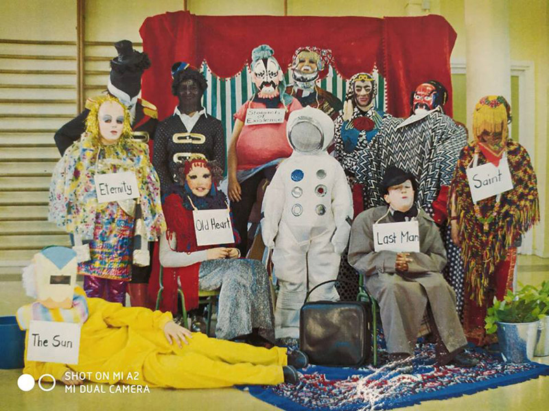
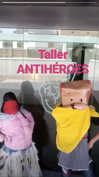
As part of its commitment with creation and critical thinking, the Center devotes a large amount of energy to educational activities, disseminated in different projects and groups of young kids; Sub>21, UHF and Espacio Mutante, with no clear boundaries between them.
CA2M asked me to conceptualize and develop communication strategies to merge all these previous groups under one specific identity and set graphic guidelines for future applications.
CA2M asked me to conceptualize and develop communication strategies to merge all these previous groups under one specific identity and set graphic guidelines for future applications.

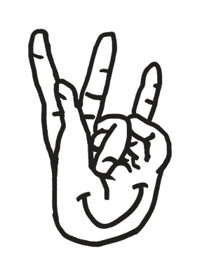
La Mano
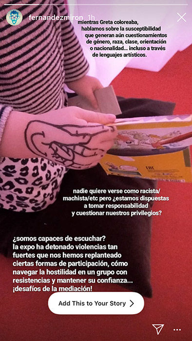
In the core of any subculture or group, there has been always a need to create a separate language of their own, apart from the understanding of a society in which they don’t fit themselves.
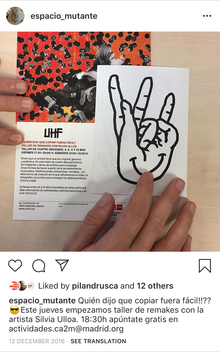
Through this idea of coded communication, I design a symbol from a hand, the most immediate, universal and flexible tool we have to “make” and “speak”, which gestures can mutate to salute, shake, fight, feel... In its original state, the fingers are arranged to contain the initials of the precedent groups (<21 and UHF) and shows a smile in its palm.
It is a gesture, a tool, a statement.

“Focus on those utopian artistic practices that foster experimental forms of organization, dissident attitudes and collective creation processes”

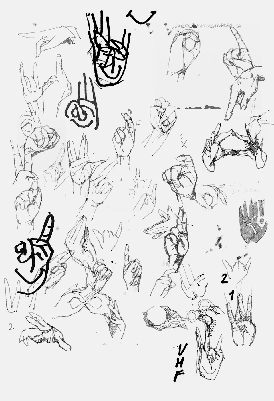
Study of gestures for logotype
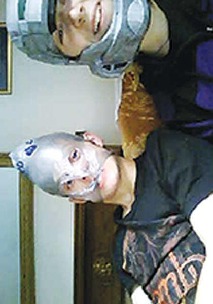
After quite some use, the young group have taken the symbol as their own, printing stickers, temporary tatoos, patches and prints, posters... even modifications from the original, something that I celebrate.
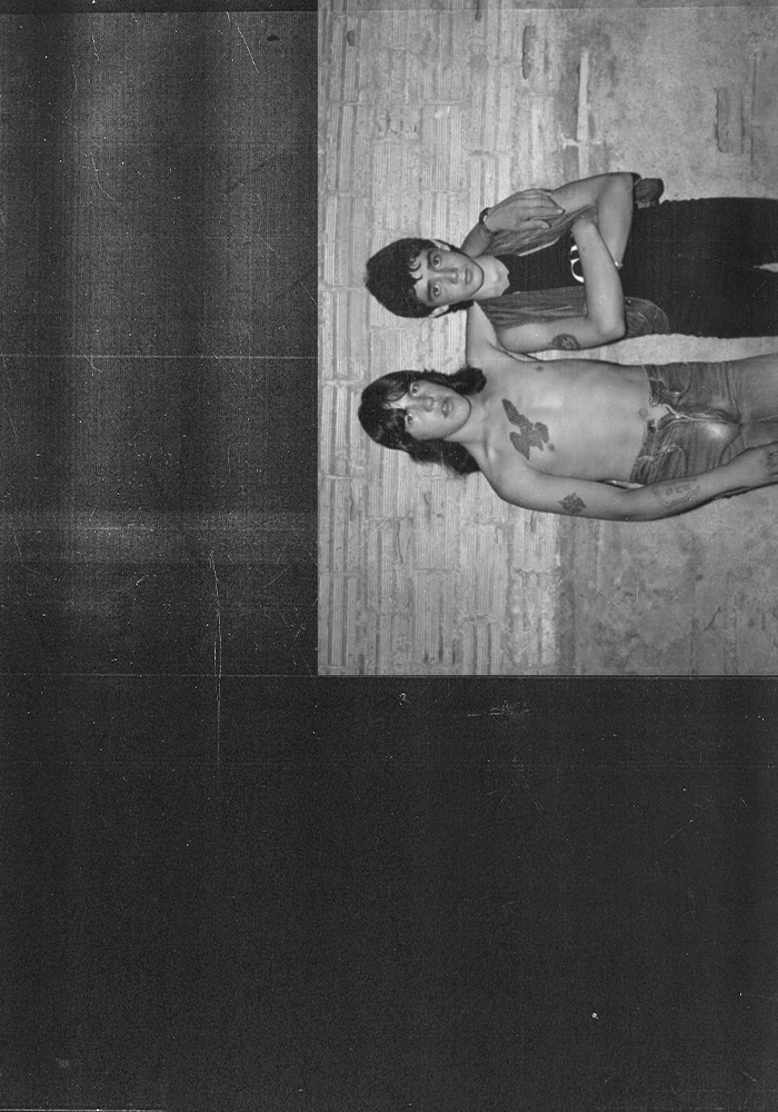
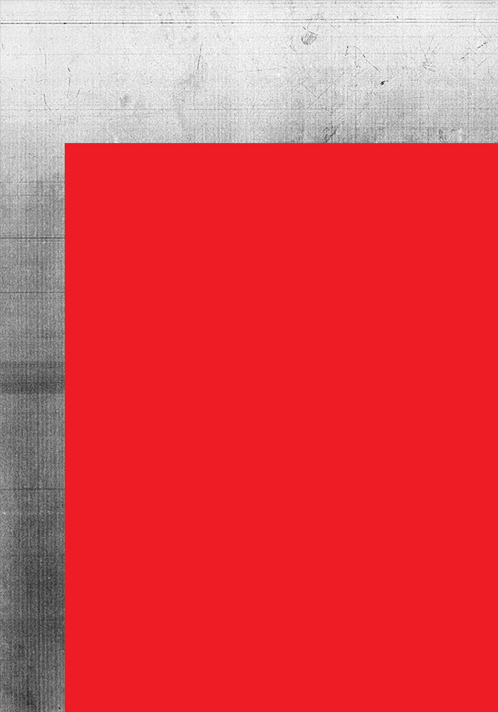
Sample Photo treatment
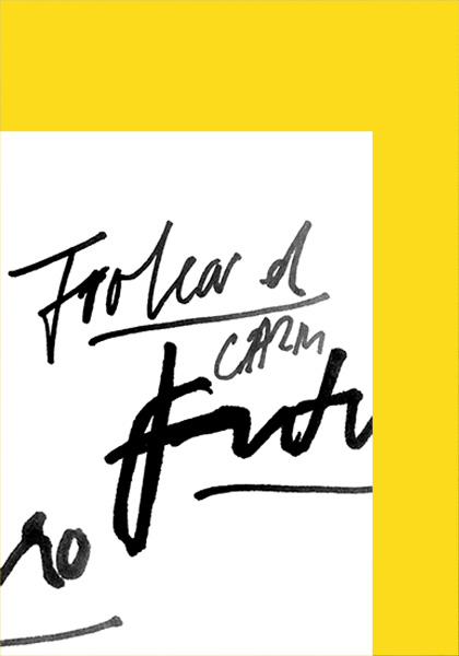
Trolear el Futuro
After the symbol is created I introduce Trolear el Futuro (Troll the future) as a general claim for the campaign, a bold statement to reinforce the actions of the group. A final call against a predestined future.
Accompanying the logotype and claim, a graphic system that aspires to represent this urgency and teen spirit.
Elements overlying like tumblr galleries and pushing compositions to the margins. Pictures treated, “photocopied” and confronted to wide areas of plain color. Free mix of image resolutions, combining hi-res from the Center archives to pixelized, mobile qualities from the young ones.
Finally, the use of different handwritings for the headlines, quickly done as if we are writing down sparkling thoughts in our hands or up in a toilet wall, right before getting caught.
The final call of a group of kids against his own destiny. A deliberate offense to confront a predestined future.