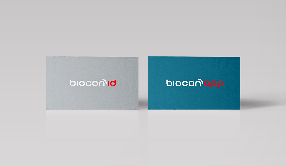
Biocon
2009
A straightforward formal approach for a smart technological company expanding its services.
Brand Identity
Graphic Design
Graphic Design


Data Services
Biocon is a Spanish technological company focused on services mainly in the clinical sector. It provides systems of storage and recovery of remote data through radio frequency identification, that ease processes within organizations.
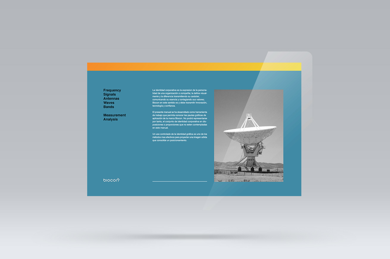
“Biocon must communicate innovation, technology and trust, and the visual identity was designed to convey and reinforce these attributes”


Assignment
and challenge
Biocon was about to face a new expansion, when they ask me to help them align their business efforts with a more open and customer-centered branding approach. Shifting from a very specific technology -Radio frequency ID- and field -clinical-, to a wider business perspective, including management, consultancy, security...
How to reflect this variety of services without being too specific or too general not to be recognizable, became the main challenge. To find a balance when designing for very wide business focuses.
As technology moves forward in such a high speed, I find very important to avoid current trends while designing for tech associated brands. This way the brand can be pushed without stress and grow naturally over the years. (Something I learnt from noticing -later avoiding- car models while taking architectural pictures)
Approach
and execution
We start identifying the core attributes of the brand, resumed in three parameters: technology, service and simplicity.
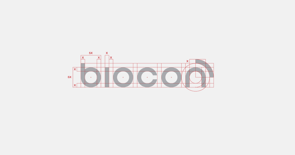
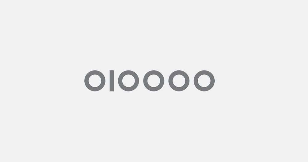
Biocon identity is built upon the purest conceptualisation of technology and the binary system. Visually reflected in ones and zeros -I and O-, these two geometrical forms provide the basic grid for the logo and associated typography.
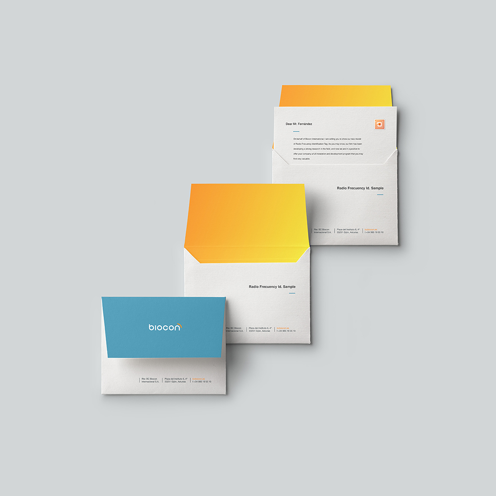
Coming from the radiofrequency sector, the company did not want to lose this concept completely, so this wave was translated into a quarter segment of a circle accompanying the last letter of the logo. The wave becomes now a transmission of frequencies, of expertise, of services as the new attribute. And the color palette brings a clean and solid approach combined with a gradient orange for a more vibrant feel.
This is a simple straightforward formal approach. With an ease rounded letter shape, the logo conveys easiness and simplicity as an essential quality of the brand