A New
Wrong Order
2017 / __
A collection of mixtapes wandering around the idea of error, conceived as an open and experimental platform.
anewwrongorder.com
Concept
Art Direction
Web Design
Album Covers
Logotype
Art Direction
Web Design
Album Covers
Logotype
“If you hit a wrong note,
it’s the next note that you play that determines if it’s good or bad”
Miles Davis
The Sound of Error
Most of the personal projects I get involved with, usually start with a naive spark and end up being way bigger than expected. A New Wrong Order started like that, as a collection of mixtapes located in Mixcloud, now expanded to its own space.
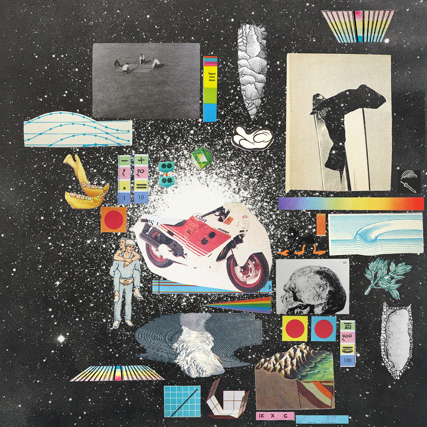
The new site allows me to get deeper in an on-going research about the idea of the wrong in music from a multiple perspective. Invite artists I like, to interpret this connection through songs and from there, pull on the thread. But also an extensive visual playground where to experiment, try and fail.

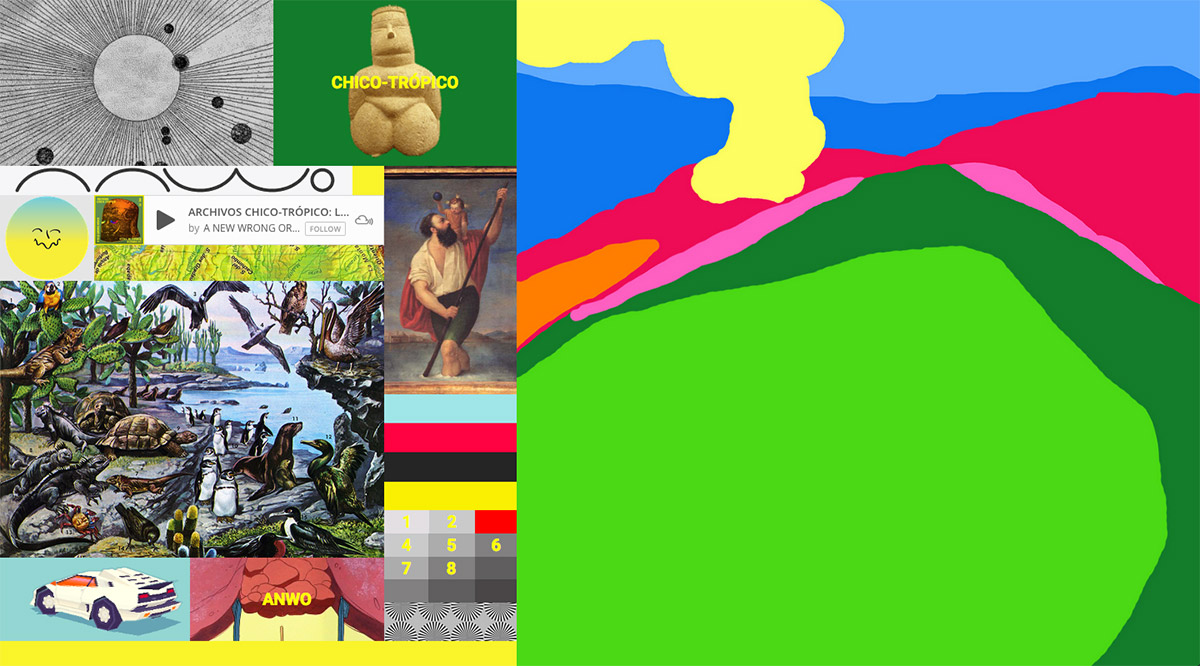

A New Wrong Web
A simple structure and a flexible grid allows me to play and adapt to every artist’s imagery and style. A constructivist approach, conceptual and visually speaking. At the end, you need no more than one click to play music and we live under urgent times.
The responsive layout wants to translate the listening experience behind a physical album -a recorded soundtrack with different layers of information and visual support- into an expanded digital version.
On the left side, a grid offers a visual collage full of related imagery of the album, with four interactive buttons for a deeper view:
O ARTIST INFO
O MIXCLOUD WIDGET
O MIXTAPE NUMBER
O PROJECT INFO (Contact)
O ARTIST INFO
O MIXCLOUD WIDGET
O MIXTAPE NUMBER
O PROJECT INFO (Contact)
The right area shows the album cover, a squared shape where the previous interactions are displayed in full, including a big red player connected to the Mixcloud widget.
Mobile View
“Whatever you now find weird, ugly, uncomfortable and nasty about a new medium will surely become its signature. (…) all of these will be cherished and emulated as soon as they can be avoided. It’s the sound of failure: so much modern art is the sound of things going out of control, of a medium pushing to its limits and breaking apart”...
A Year With Swollen Appendices
Brian Eno
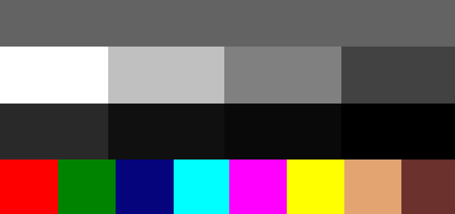
Color Correction Chart
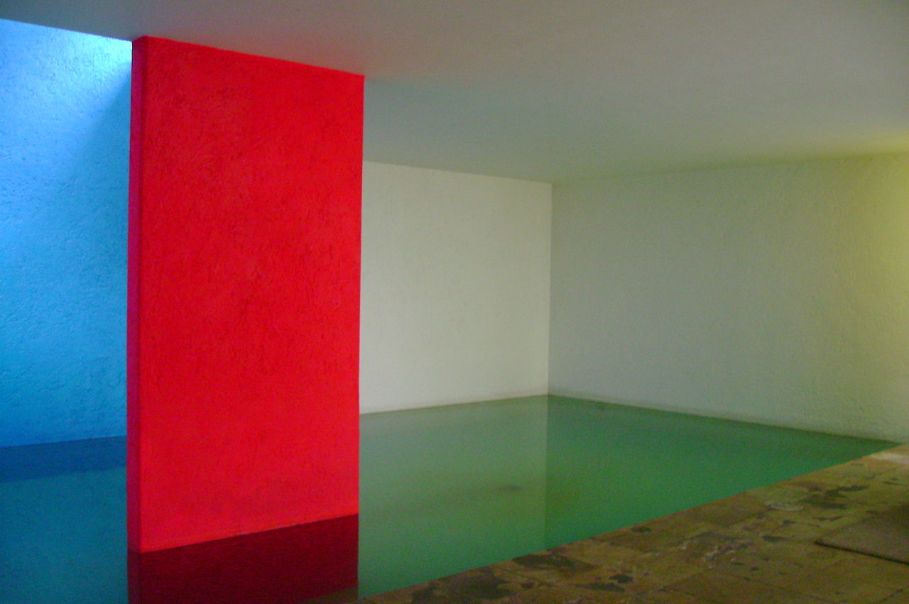
Casa Giraldi
(1976) Luis Barragan
(1976) Luis Barragan
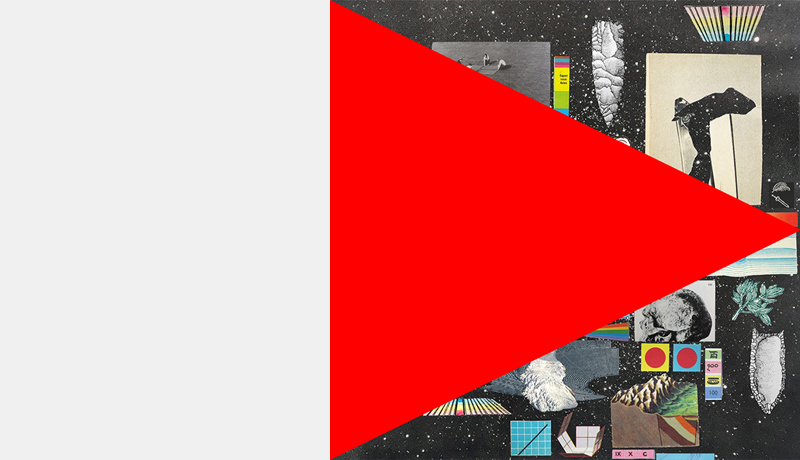
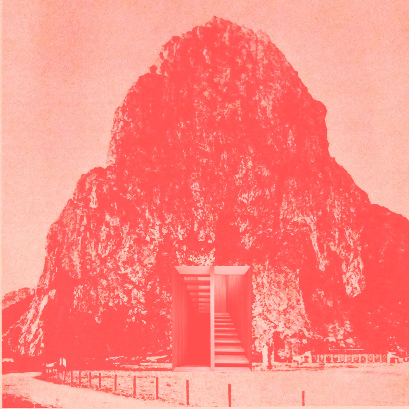
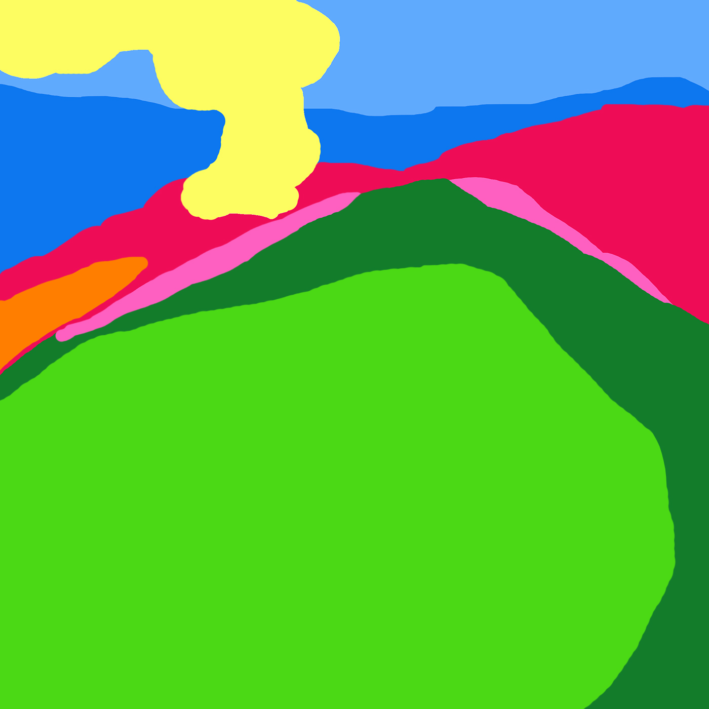
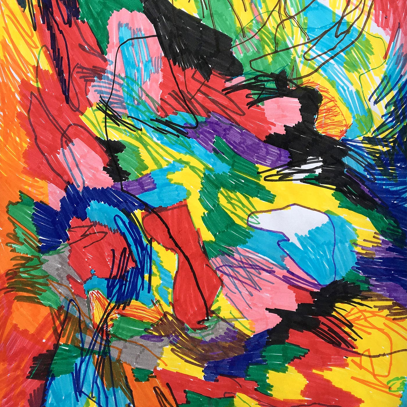
Album Covers
Vol. I Silly Europeans
Vol. II Pseudobruitismus Africamus
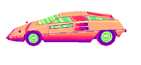
Vol. III Chico-Tropico
Vol. VI Alex Silva
Vol. VII Troya Modet
Vol. VIII Atomizador
Vol. IX Aries
Vol. X DJ Sabroso

Vol. I
Vol. II
Vol. III
Vol. VI

Vol. VII
Vol. VIII
A New Wrong Logo
Drawing inspiration from emoji culture and halfway between the anti-nuclear campaigns of the seventies (Smiling Sun) and the raving Acid House parties (Smiley). The logo embraces a playful spirit of resistance against the adversity and the wrong. A broken face of enjoyment over discomfort, represented here in a gradient turquoise.
The rounded shape is also a reminder of a disc that spins as music plays. Highly adaptable to geometric interfaces and with a great catalogue of potential gesture variations.
A nuisance that tickles.