Hovedbanen
2021
A display font inspired by a neon clock in a train station. A typographic response to wanderlust.
Tipography
Concept
Concept

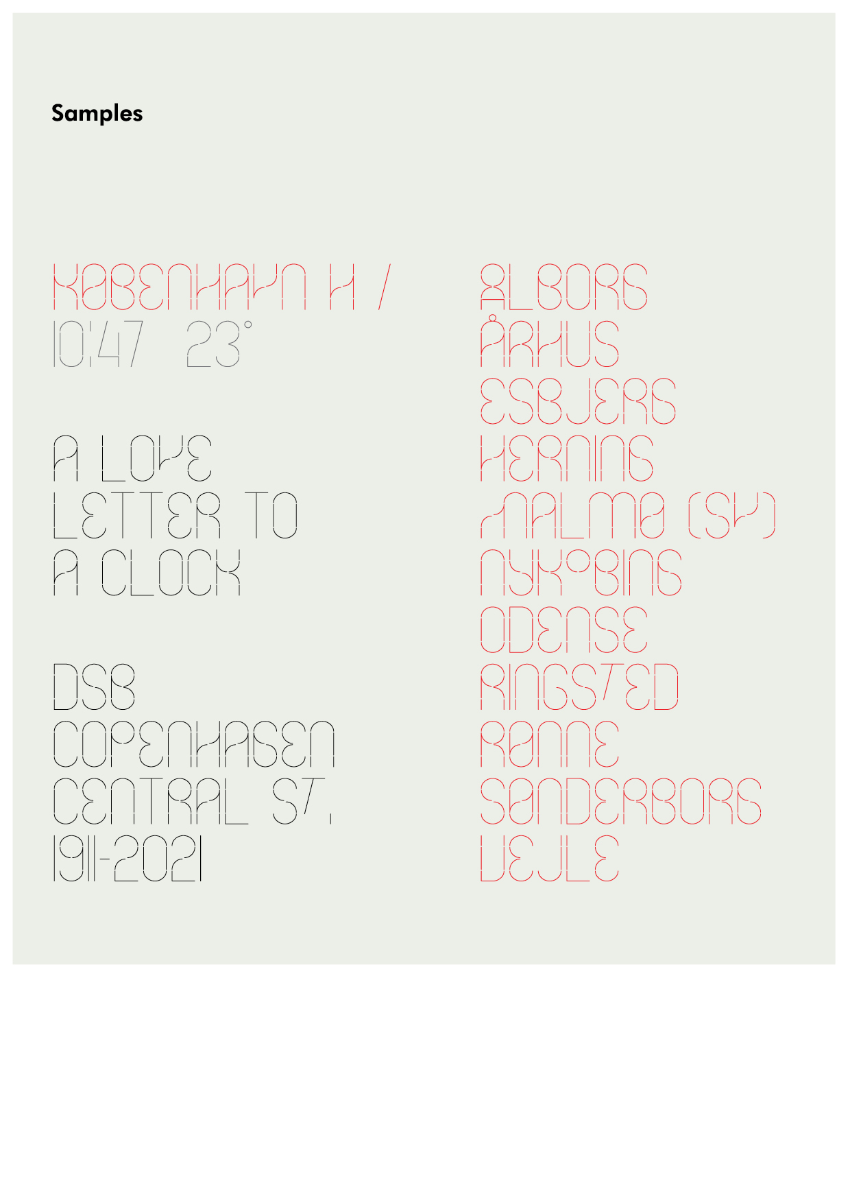
A love letter to a clock
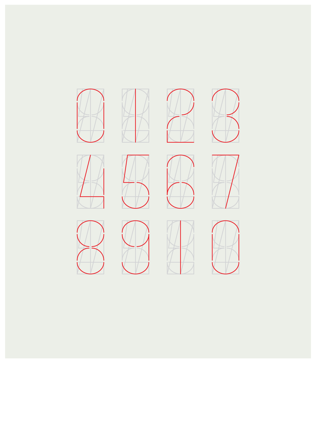
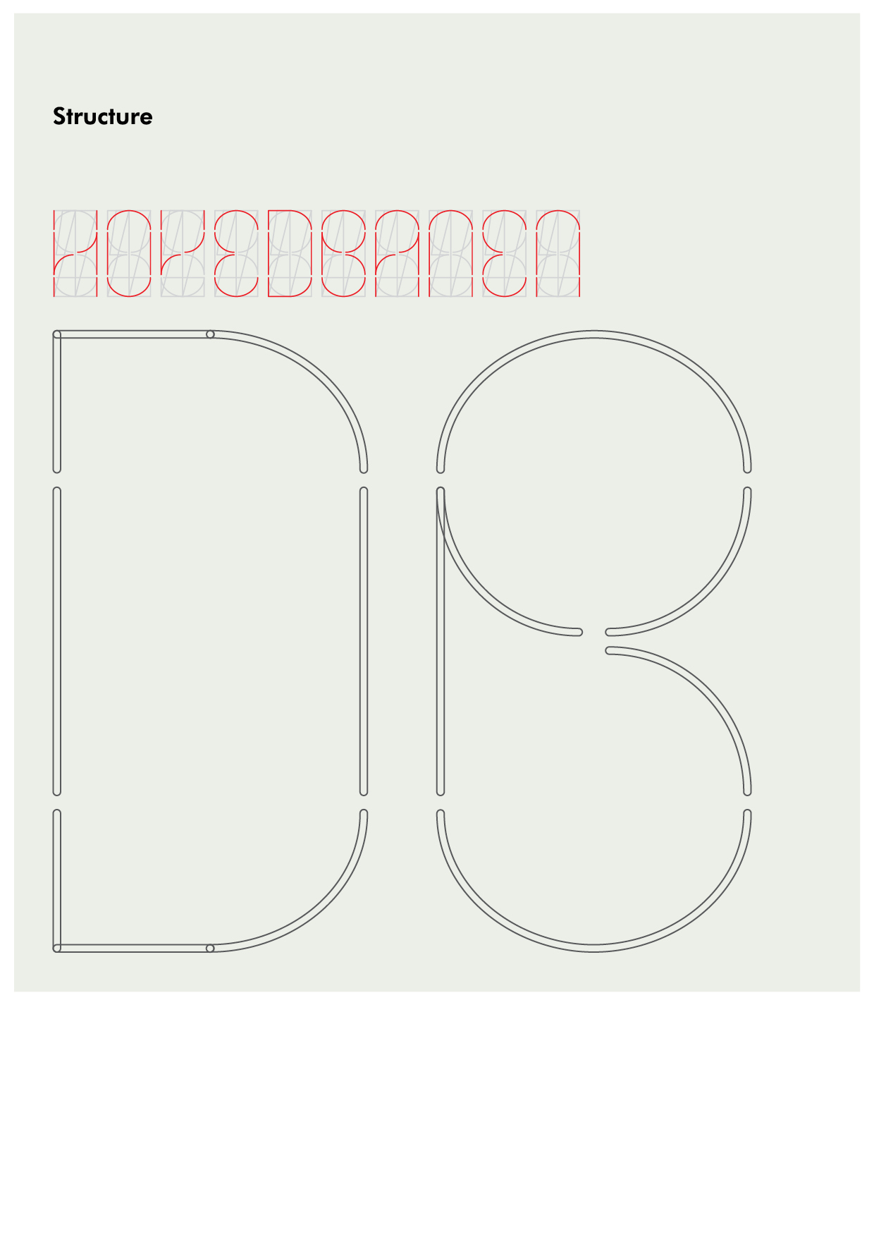
Hovedbanen is a display font inspired by the neon clock of the Central Railway Station in Copenhagen. A typographic response to calm the impulse for travelling during pandemic times. Every character is designed using its original neon structure; a love letter to a clock.
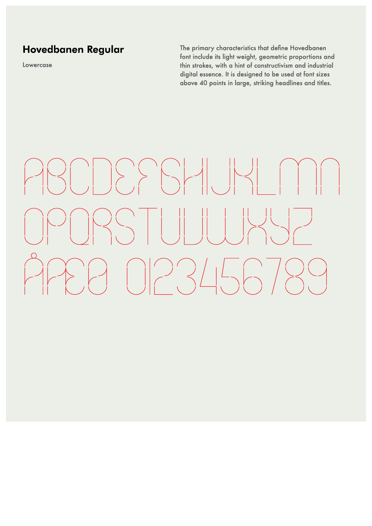
The primary characteristics that define Hovedbanen font include its light weight, geometric proportions and thin strokes, with a hint of constructivism and industrial digital essence. It is designed to be used at font sizes above 40 points in large, striking headlines and titles.
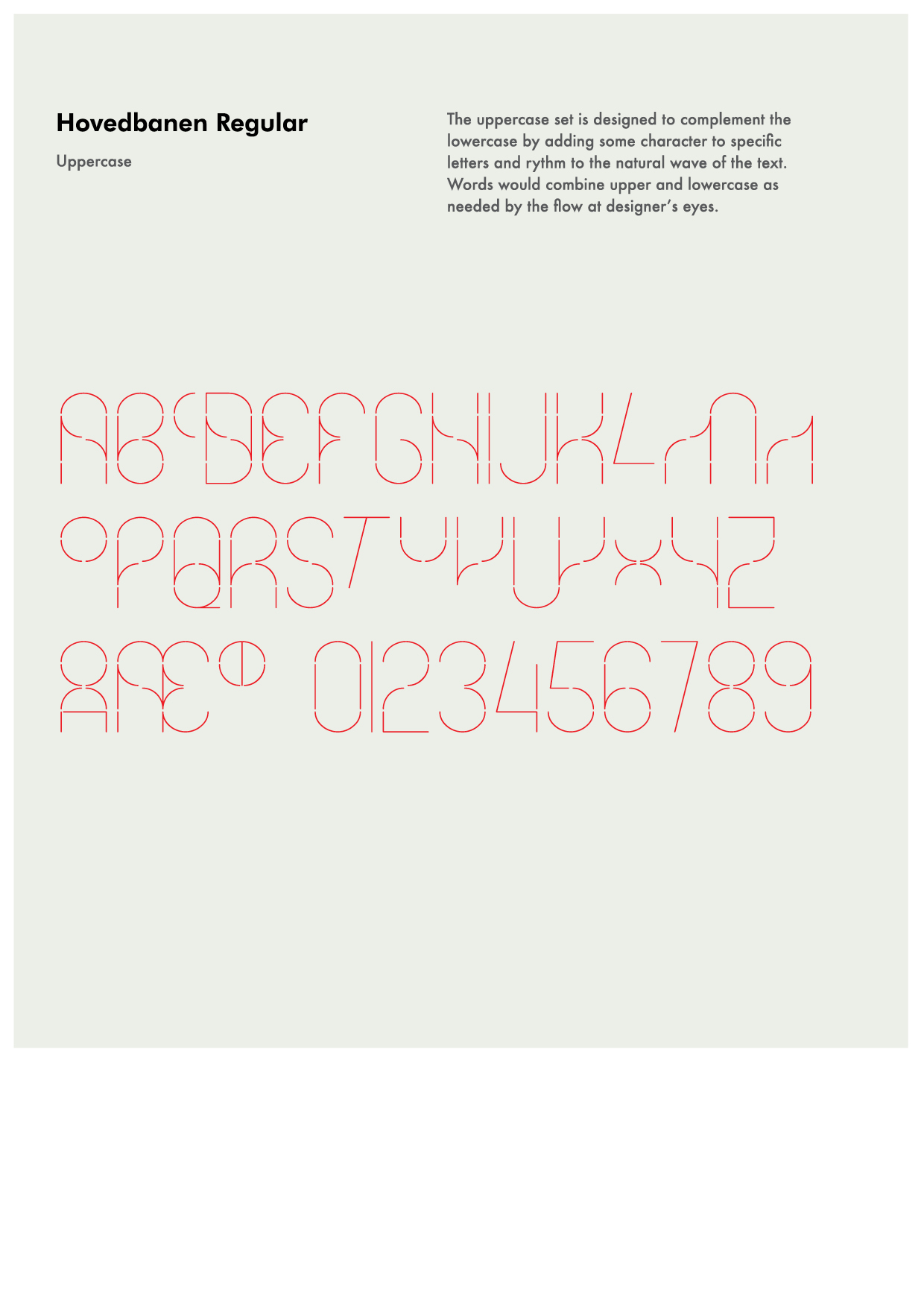
The uppercase set is designed to complement the main set by adding some character to specific letters and rythm to the natural wave of the text. Words would combine upper and lowercase as needed by the flow and designer’s eyes.
An online version is connected to the timetable of the station, turning the font into a medium to visualize in real time the activity of the station.